TwoCar by MYEG
Writing UI Copy and humanize a website's UX text.
TwoCar is a digital service created by MyEG to help Malaysia's used vehicle dealers. It makes buying and selling cars and motorcycles simpler by handling ownership transfers safely online. Instead of dealing with paperwork and government offices, dealers can complete everything through the TwoCar platform or mobile app.
PROJECT NAME
TwoCar
WHAT I DID
UI copywriting, UX Writing
TOOLS
Figma, Google Doc
DURATION
April 2025 - June 2025
TwoCar by MyEG helps Malaysian used car dealers buy/sell vehicles easily. It handles secure online ownership transfers & road tax renewals, replacing paperwork and JPJ visits. Dealers manage everything through the site.
CHALLENGE: One key challenge was bridging communication between the design team and the business team. We needed to align on what users expected versus what the system could realistically deliver. For example, when moving from batch renewals to individual renewals, the challenge was how to present messages in a way that clearly explained the change without confusing users.
GOAL: The goal was to make digital services clearer, consistent, and increase trustworthiness. I focused on simplifying complex terms, and surfacing critical details like refunds and delays. By prioritizing transparency, clear hierarchy, and user-friendly language, I helped reduce confusion, ease user anxiety, and create a more seamless experience across web and mobile.
THE WORK
The Problem
There were several pain points when discussing about the renewal process. Common pain points included:
-
Users thought system errors meant their payment failed.
-
No clear indication what retrying actually means.
-
The system didn't clearly show the difference between temporary delays (payment still processing) and payment failures.
Collaboration
This first order of business would be to understand the information hierarchy. This is done through the discussion with the designers, as well as the business developer, who deals with the users of TwoCar directly. This gave the team an idea on what the users were to expect when facing certain error messages and the tone that can be used.

Process
The redesign started by analyzing all possible status user needs could face for their transactions (success, fail and processing). I wrote multiple message variants for every scenario, focusing on four key elements:
-
Immediate status comprehension (clear title and body copy)
-
Clear explanation of system actions. For retrying transactions, we added progress indicators and time estimates.
-
Failed transactions always surfaced the refund policy upfront while providing easy access to details.
-
Successful batches offered completion confirmation.
THE RESULTS
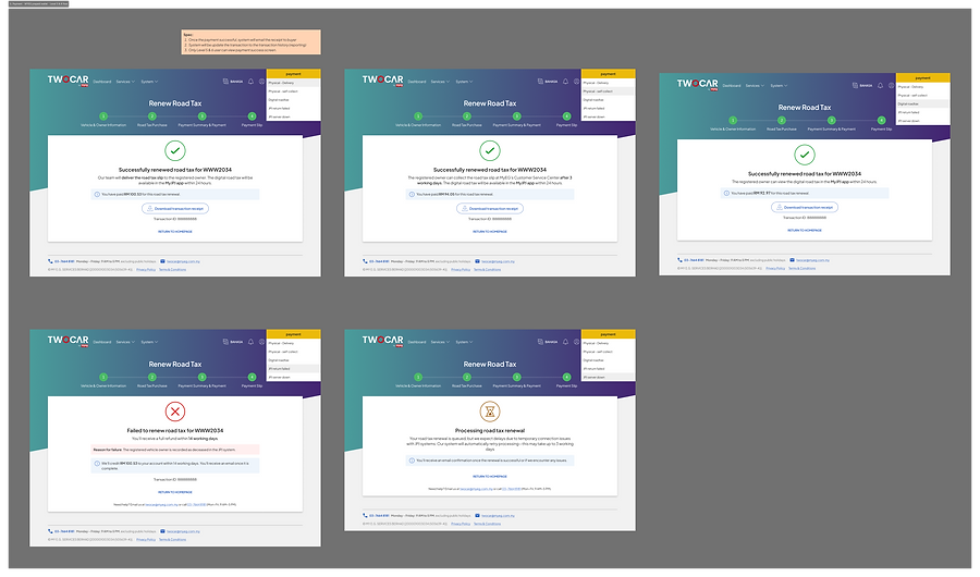
The final design standardised transaction status displays (successful/retrying/failed) with clear action buttons and refund policy visibility.

Clear Status and Description
We replaced generic status messages with clearer labels: Successful, Processing, and Failed. These terms are short, familiar, and instantly understood, which helps reduce confusion and user anxiety during critical tasks like payments.
They also create a natural way to add guidance , such as what to do next, so users feel informed and in control instead of lost.
Automatic refund clarity
We made refund transparency a top priority in the information hierarchy to build trust after a failed transaction. By clearly stating 'All failed transactions will be refunded within 14 working days', we addressed the user’s biggest concern which is ‘Will I get my money back?’.
This turned a potentially negative experience into an opportunity to reinforce the platform’s reliability and commitment to its users.


Clarity During Processing
We discovered that uncertainty frustrated users more than the wait itself. For delays caused by external JPJ system issues, we provided short, honest explanation by stating 'Your renewal is queued, but we expect delays due to temporary connection issues (may take up to 3 working days).'.
This reassured users their transaction wasn’t forgotten, set clear expectations, and reduced the need for them to keep checking back unnecessarily.
The key takeway
The most interesting insight from redesigning these error messages was understanding what the users were expecting when an error messages appear vs what we thought were important.
Our approach shifted from simply reporting system states to actively managing user anxiety. We treated error states as critical communication moments, not just problems to log.
Instead of stopping at an explanation, we gave users clear steps they could take to fix the issue. This turned frustration into understanding and showed that trust and loyalty grow when users feel respected, informed, and supported even when they hit a roadblock.